
Website redesign
Improving the sfjazz.org user experience to increase membership signups and donations during the COVID shutdown.
Increasing donations and digital membership signups was key to driving revenue at a time of major financial pressure within the arts & culture sector.
-
The SFJAZZ website lacks a straightforward donation and membership signup process.
-
How might we improve the design of sfjazz.org to increase membership signups and donations?
My team employed a mixed-method approach to capture a broad range of user sentiments and behaviors. We employed the following methods:
-
Heuristic evaluation
-
User interviews
-
Survey
-
Card sorting
-
Usability testing
Our research uncovered several flaws in the current UX. We produced and tested an interactive prototype incorporating design improvements, including:
-
Streamlined checkout process.
-
Simplified messaging around donations and membership signups.
-
Improved information architecture.
Our research clarified ambiguous user needs and led to an improved UX for “membership” and “donate” pages. The project contributed to:
-
92% increase in digital membership signups between 2021 and 2022.

“Harry and his team were a joy to work with. They dove deep into SFJAZZ.org's UX, delivered a comprehensive report, and provided clear and actionable recommendations that SFJAZZ hopes to implement in the near future, which will undoubtedly improve our customers' experience. Thanks again!”
– Ross Eustis, SFJAZZ Digital Projects Manager
At a glance
Timeframe
3 weeks
Deliverables
Figma prototype + slide deck
Team
UX Researcher (me!)
3 UX Designers
Clients
Web Producer
Digital Projects Manager
Head of Marketing
Tools
The challenge
SFJAZZ is an internationally recognized non-profit organization that works to develop the audience for jazz in the San Francisco Bay Area and beyond. Its revenue is driven by its busy calendar of events, most of which take place in the state-of-the-art SFJAZZ Center in downtown San Francisco.
However, following the outbreak of the COVID pandemic, SFJAZZ was forced to close its doors. In the absence of in-person events, the organization started to promote digital memberships. Members pay an annual subscription fee to gain access to exclusive content, including live-streamed and pre-recorded concerts.
SFJAZZ also wanted to increase charitable donations to offset some of the revenue lost from the cancellation of its live shows.

Week 1: identify the problem space
Stakeholder interviews
My team interviewed our clients on a Zoom conference call for 60 minutes. The clients highlighted current business priorities and explained constraints around their design system and CMS platform.
Heuristic evaluation
Based on this conversation, I undertook a heuristic evaluation of the SFJAZZ website using Nielsen's 10 Usability Heuristics. This was a quick and cost-effective way of evaluating high-level usability problems with the site so that we could deploy user research more effectively.
I focused on three user flows that were most pertinent to our research topic:
-
Discovering programs
-
Becoming a member
-
Logging in to watch concerts

Homepage introduces membership but could be more concise and clear in labeling.
Explore options to revise the information architecture, consolidating similar categories.

Ambiguous and repetitive link labels in primary navigation and in-page navigation create uncertainty and detract from discoverability of membership opportunities.
Improve scannability by shortening the text and adding bullets or other formatting.

Explore alternative layouts to reduce repetition of benefits and support comparison.
Competitive analysis
I also undertook a competitive analysis by comparing the SFJAZZ website with websites of other nonprofits in the arts and culture sector.
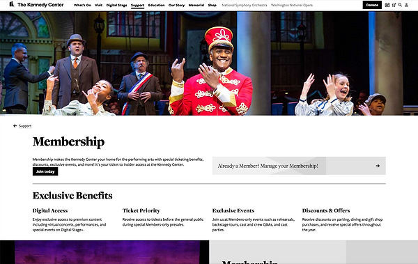
Common benefits are listed at the top and specific/additional benefits are listed below for each level. This content chunking and formatting supports quick scanning.
Benefits of membership clearly signposted.
kennedy-center.org
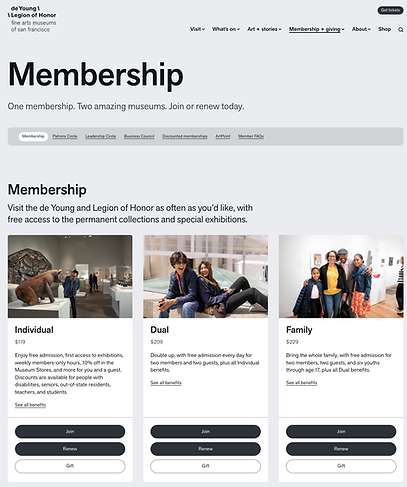
Clear headings with short descriptions in this card layout support scanning to quickly identify key membership levels and read more about each.
famsf.org
Week 2: gather user insights
User
interviews
The next step was to speak to SFJAZZ’s customers so that we could better understand users’ aims, expectations, and pain points when navigating through sfjazz.org.
We interviewed 7 people in total – all Bay Area residents aged 45-65 who were interested in music (SFJAZZ's core demographic). All of them were familiar with SFJAZZ, although not necessarily regular customers. (Ideally, we would have spoken to more people who frequently attended SFJAZZ events.)
We conducted 45-minute moderated remote interviews via Zoom. For the first 20 minutes, the interviewees were asked some general questions about their experience with SFJAZZ and their attitudes to donating to non-profits. During the second half of the session, we conducted formative usability testing on the current website. Participants were asked to perform three tasks: make a donation, sign up for membership, and find out what virtual concerts are showing next month.
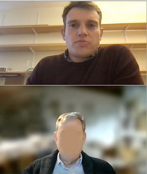
An interview in action!

Affinity mapping on Miro
Key insights
-
Cost, travel time, and COVID risks deter some people from attending live performances.
-
People want value for money from memberships.
-
People feel annoyed when non-profits do not clearly disclose how their donations are spent.
“I go to fewer live shows than I used to in pre-COVID times but I still love watching jazz concerts on YouTube.”
Alan, 54
Usability issues
-
Some users struggled to find donate page – possible confusion between ‘support’ and ‘donate’?
-
Differences between membership categories are not clearly highlighted.
-
Users took a long time to complete Becoming a Member flow – high risk of frustration or dropoff.
“If I’m going to become a member, I want to make sure I’m getting good value and that my money is going to a worthy cause.”
Kiara, 60
“What does ‘support’ mean? I don’t know what I’m supporting....”
(Matthew, 58)
“I’m struggling to tell the difference between regular and premium membership. Why would I pay more for basically the same thing?”
(Liz, 45)
Survey
We also gathered quantitative data to understand people’s habits and attitudes to donating to non-profits and to find out which of SFJAZZ’s offerings are most appealing to customers. We circulated a Google Forms survey via email and social media and received 21 responses.
(Given the low response rate, the survey results were of limited value; the responses to the open-ended question were most useful in generating additional qualitative data. More responses would be necessary to ensure that the data is statistically significant.)
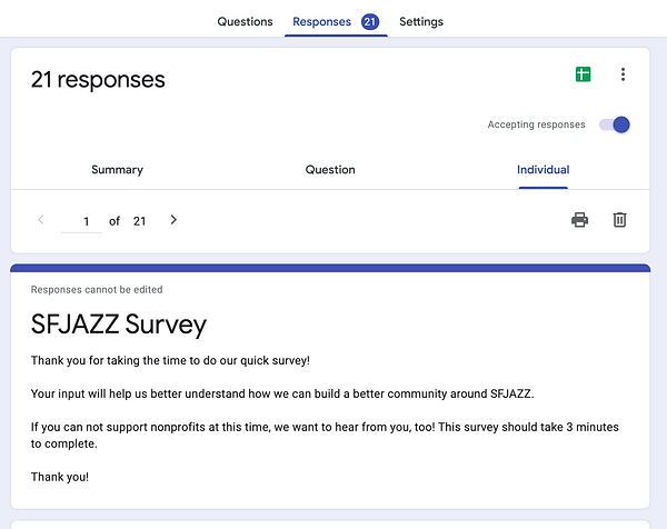
Our survey on Google Forms
“Better outreach and advertising upcoming events.”
“Bring more awareness to their organization/cause.”
“Increase online presence. We’re very risk-averse with respect to COVID.”
“Use social media to advertise benefits of membership.”
Survey question: What would make you more likely to become an SFJAZZ member?
Key insights
-
The value of SFJAZZ’s digital offerings could be better communicated.
-
Lack of awareness about SFJAZZ’s membership benefits.
-
Interest in attending live events currently outweighs interest in joining membership program.
Card sorting
The UX audit and user interviews suggested that the navigation labels "support" and "donate" are ambiguous and potentially confusing, so I performed an open card sorting activity to identify areas of improvement in the website's information architecture and content strategy.
The study was administered via UXMetrics.com and elicited 20 responses. Participants were given existing page titles and asked to group them into categories and assign a name of their choosing to each category.

Results of our UXMetrics.com study
Key insights
-
Participants tended to group "donate" and "membership" pages together (currently separate on website).
-
Most participants used "give" instead of "support" as a label for donation pages.
Opportunities
-
Consolidate content under "donate" and "support" into single category ("join and give"?).
-
Change "support" to "give" in nav header and call to action buttons.
Week 3: create, test, and iterate design solutions
Wireframing + prototyping
Based on our research findings, we designed and tested wireframes for the homepage and membership and donate pages. We first worked on wireframe sketches and brought the most promising ideas together in a low-fidelity prototype.
Usability testing
We conducted a round of formative usability tests on the wireframes, in which we asked 5 users to complete the core tasks outlined in the task flow.

“The amount of text is a bit overwhelming.”
"Nice, clean layout."
"It's good to know how my money will be spent."
"I don't need these options."
What's working well
-
Users said they were more inclined to become a member and/or donate after seeing the design.
Areas for improvement
-
Increase task completion rate from 85% to 100%
-
Continue to reduce text and add bullet points on Membership page.
-
Navigation works well but some labels are still confusing (e.g. “Collective”).
Based on feedback from first round of usability testing, we iterated on the design and developed a high-fidelity prototype, which we tested on 5 users with the same testing script. We achieved a task completion rate of 100%.

Key Findings and Impact
Findings
What's working well
-
Striking photographs of artists and performances are appealing and make membership an attractive option.
-
Page headings clearly describe each page and step of the checkout process.
-
Navigation is consistent across all pages. Calls to action are noticeable on each page.
Top areas for improvement
-
Consolidate and streamline the steps in the checkout process.
-
Simplify messaging around donations and membership signups.
-
In general, but especially for the SFJAZZ demographic, it’s important to follow design conventions and optimize for ease of use.
Impact
-
Membership sign-ups and donations increased by 92% in 2021-22.
-
Provided stakeholders with foundational research study clarifying the needs and attitudes of their customers.
-
Delivered prototype highlighting solutions to current design problems.

Original design


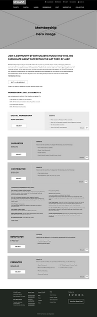
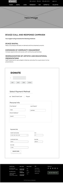
Our solution
New design
Our recommendations are reflected in the redesigned homepage and donation pages, and simplified navigation menu.
"Support" and "Membership" consolidated into single category ("Join & Give")
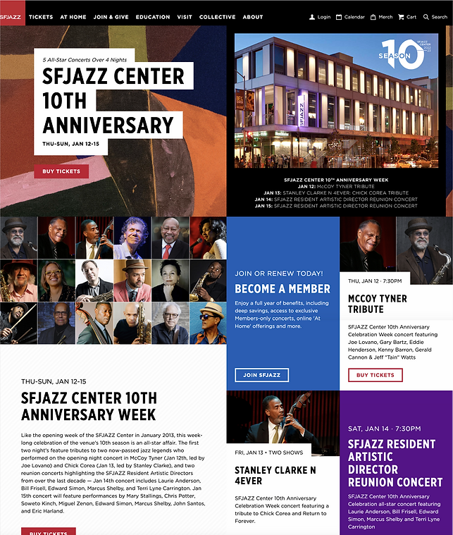
Benefits of membership clearly signposted with unambiguous call to action button and concise text description.
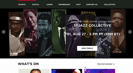
Current sfjazz.org homepage
Concise and impactful statement of how the donation will be used to support SFJAZZ's mission.

Advertising membership benefits prior to checkout incentivizes SFJAZZ customers to become members.
Clear checkout button helps navigation and avoids unnecessary additional steps.
New donation pages